This is a fascinating chart that shows the difference between the current recession and everything after the Great Depression. As you go further back in time the data become less and less comparable to today’s situation, so we can’t really look at the craziness in the 19th century. I’m reading a lot of economics these days, trying to make sense of where we should go as a state. I’ll let you know if any of the people in the blogosphere have great answers. 🙂 This one comes from www.calculatedriskblog.com.
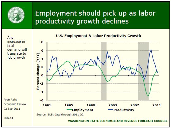
One of the interesting changes over time is the long recovery curve on jobs in the last two recessions. We are seeing “jobless recoveries,” or a return to economic output and stock market performance without comparable hiring. Our state economist Dr. Arun Raha thinks that we’re nearing the end of this, as worker productivity growth has slowed. (This means that companies have extracted about all they can from getting people to work harder and put in more overtime.)
The chart above should link to the entire Economic Review.
I’m not convinced this is true, or at least not in the larger sense of the idea. The story of the post-war period has been an increase in the productivity of American labor, with more and more production coming with fewer and fewer people. There are jobs for highly educated people who get paid good wages, and jobs for those with little education who make very little, but middle-income jobs for people with only a high school education are vanishing.
The Seattle Times wrote about this topic today: Study shows state’s middle-class jobs not expected to grow
The prescription for us as a society is clear. We need to increase our overall level of productivity so that we can continue to have higher wages than the rest of the world. I worry about the impact our current budget situation is having on our education infrastructure and on our ability to make those investments.


